Here's a bunch of flags !

"this one looks awful damn"

  This list of country flags consists of :

- Countries defined in ISO 3166-1: which supposidly includes 249 countries.
- Kosovo: Despite not being part of ISO 3166-1
- Constituent countries of the United Kingdom: Individual countries of the UK that are part of ISO 3166-2:GB (England, Northern Ireland, Scotland and Wales)
- Occupied Palestine is not included but would land right above Tokelau flag wise
- Antarctica not having an official flag, I put both main designs
- I can’t figure out which version is the official one for South Sudan so I put both blues
- Other ones defined in ISO 3166-2
This somehow only brings up the number of flags to 255

* Souvereign State - Official Name

  Flag list :

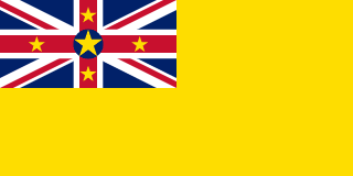
#255 Niue :

New Zealand - Same as self

1:2 ratio
Union Jack -100 points, big blank space -100 points, random clutter -100 points, yellow all over -100 points... Over all of the flags I've seen this is by far the worst one without any doubt. It manages to be both overcrowded and empty. At least it defaced the Union Jack

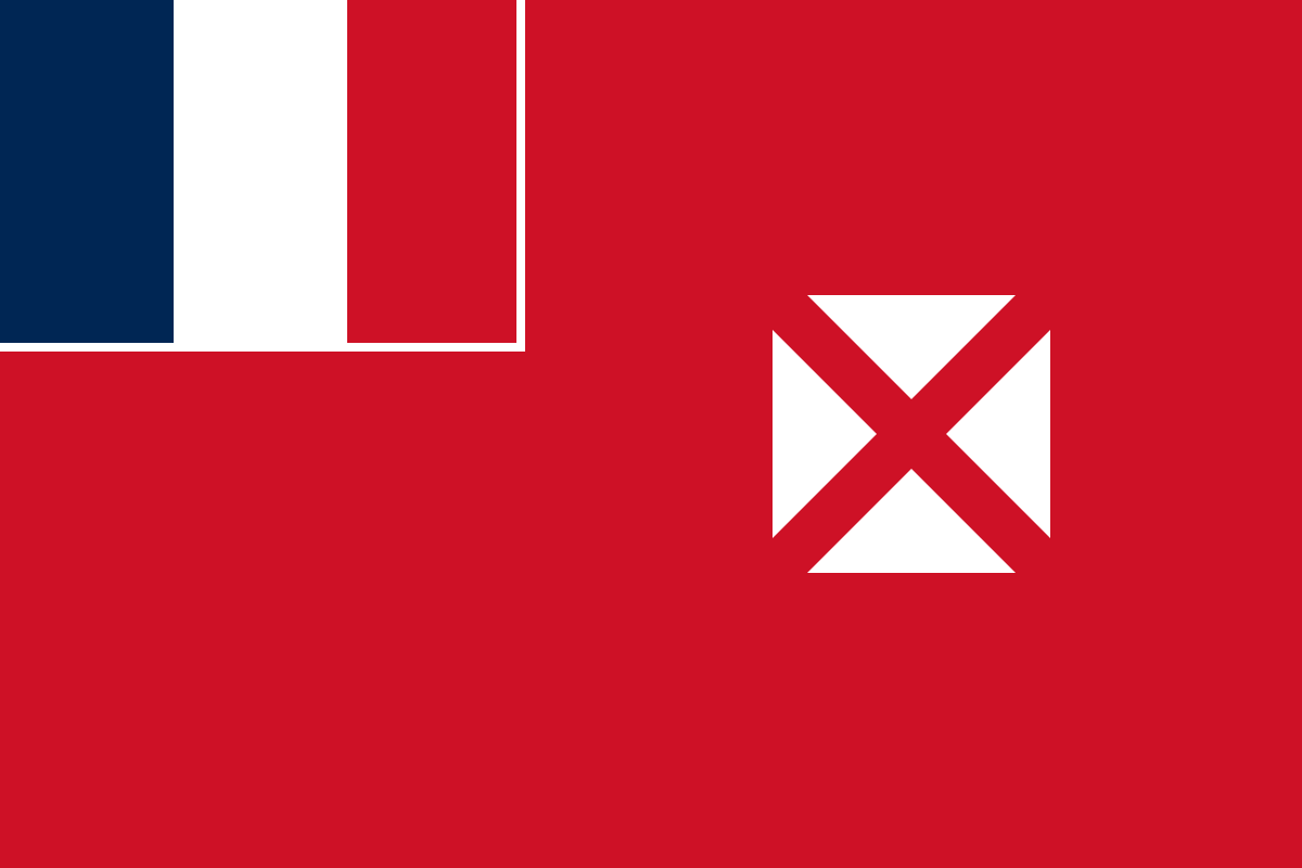
#254 Wallis and Futuna :

France - the Territory of the Wallis and Futuna Islands
Absolutely horrid use of color, an absolute atrocity. Nothing is even remotely good about this flag.

2:3 ratio

#253 The French Southern and Antarctic Lands :

France - Same as self

2:3 ratio
Same as the previous one, it just looks like an eysore. At least the "logo" looks alright I guess. Still not very flag like.

#252 Madagascar :

Self - the Republic of Madagascar
This is the most flag looking least good looking one so down on this list. For some reason the white, red, green combo in that order makes no sense to me. It isn't very evocative of madagascar either. When the flag was designed the colors didn't even have meanings like ??? You make a flag with cool proportions but you end up with this...

2:3 ratio

#251 American Samoa :

United States - Same as self

1:2 or 10:19 ratio
You colonize an island and put a fucking eagle like you're some badass freedom nation. You're not... This looks bad and it doesn't even take the design of the flag of Samoa into consideration. Also the proportions are wierd.

#250 The British Indian Ocean Territory :

United Kingdom - Same as self
The contrast makes no sense, it's too cluttered and it just overall looks bad. Apparently the Commissioner for the British Indian Ocean Territory wanted that design back in 1990 when it was handed to him. I would have said no, go back, reiterate.

1:2 ratio

#249 United States Virgin Islands :

United States - the Virgin Islands of the United States

2:3 ratio
This one looks a bit better but I think I have a problem with eagles. The white bg makes it look unitentional and unfinished. The thing in the middle looks just wrong and barely even resemble the american flag.

#248 Jersey :

British Crown - the Bailiwick of Jersey
Before I talk about the flag, Jersey is an autonomous and self-governing island territory of the British Islands. Although as a British Crown Dependency it is not a sovereign state, it qualifies as a small nation or island country. Also Bailiwick is a very cool name for a territory. Sadly the flag looks pretty bad. It's as bland as plain rice. The lions don't bring any cool factor despite having three of them. It's just bad...

3:5 ratio

#247 Mayotte :

France - the Department of Mayotte

2:3 ratio
Who did this. Why would anyone design a flag in such a way ??? (pretty cool seahorses tho)

#246 The Turks and Caicos Islands :

United Kingdom - Same as self
I despise this shield with such passion and fury that this deserves to be this low despite not looking too bad.

1:2 ratio

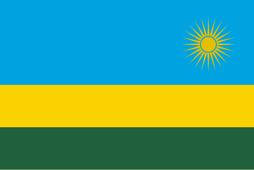
#245 Rwanda :

Self - the Republic of Rwanda

2:3 ratio
This straight up looks like a child's drawing. This was my second lowest before I learnt about the existence of way worse flags but still. Quote "Rwandan artist and engineer Alphonse Kirimobenecyo designed the flag, which depicts the sun illuminating Rwanda's abundant vegetation. As a symbol, the sun represents national unity and transparency, and the enlightenment of the Rwandan people". This is straight up just a drawing of the Rwanda landscape done by a 4 yo.

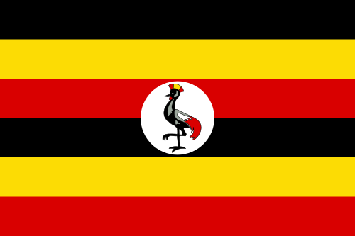
#244 Uganda :

Self - the Republic of Uganda
I have a bit of a soft spot for it but just like the Catalonia flag (not present on this list because I'd have to include too many flags if I did) I don't like the stripes. The grey crowned crane is quirky and all but the stripes are just too much.

2:3 ratio

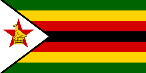
#243 Zimbabwe :

Self - the Republic of Zimbabwe

1:2 ratio
(Official flag on the left) This looks like a xeno gender flag if you only picked bad colors. The white part looks out of place. At least the bird on the star somehow works to me. Apparently it isn't a specific bird and it's just known as the Zimbabwe Bird. The presidential Flag (right) is even worse, idk what the designer(s) were thinking.

1:2 ratio

#242 Guadeloupe :

France - Same as self
Lys fowers are always a big no-no for me because of the royalist political movement using it and of course it's use throughout French history. It really cements the island as a modern colony despite having the posibility to break away from that awful history. The rest of the flag is alright but the layout is pretty bad. The sun apparently has 30 rays which looks quite good and behind it is some sugarcane.

2:3 ratio
1:2 ratio (other unofficial way better flag)

#241 Sint Eustatius :

part of Caribbean Netherlands - Bonaire, Sint Eustatius and Saba

2:3 ratio
The colors and the red outline really throws me off for some reason. It makes it not look like a real flag. Maybe something like Guam's flag would have been better. Simplicity can really be the key to some good flag design and the simbols should be strinking in my opinion (not subduded on a white background like here).

#240 The Cocos (Keeling) Islands :

Australia - the Territory of Cocos (Keeling) Islands
Probably the first alright looking flag on this list. It's so low only because the placement of each element is very off and makes them look like they overlap each other a bit.

1:2 ratio

#239 Uruguay :

Self - the Oriental Republic of Uruguay

2:3 ratio
By far the worst sun out of every flag, it's creepy, has a wierd shape and idk, I don't like it. The white and blue stripes alternate with white ending up on both ends which makes it look so wrong. This is probably the main reason why it's so low. However this is only the main flag and Uruguay has three official flags. The first one here is "the National Pavilion" (Pabellón Nacional) but there are also the Artigas flag and the flag of the Treinta y Tres. They would both land pretty far down on the list anyway but only the National Pavilion is considered within this rating. To speak a bit about the other flags the Treinta y Tres where the words Libertad o Muerte ("Freedom or Death") are put front and center is pretty badass. I don't have anything to say about the Artigas flag.
↖ Treinta y Tres ↖ Artigas flag

#238 Saba :

part of Caribbean Netherlands - Bonaire, Sint Eustatius and Saba
Just a pretty bad design for a flag, nothing much to add here

2:3 ratio

#237 Jordan :

Self - the Hashemite Kingdom of Jordan

1:2 ratio
construction sheet
This flag's proportion has changed throughout of history quite a few times and sadly I dislike the current one the most. The red chevron (triangle) has it's sides, from the base to the opposite corner, coincide with the diagonals of the 1:2 rectangle shaped flag. This makes it look akwardly too long and the stars placement feels off and quite arbitrary despite a very intentional design behind it (see construction sheet). It would otherwise be an alright flag but those propotions are just too strange.

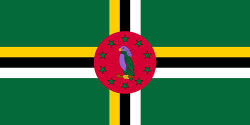
#236 Dominica :

Self - the Commonwealth of Dominica
The purple Sisserou parrot is the only good part of the flag and even it looks off. Bonus points for having purple (sorry Jordan and the others below). The rest of the flag is extremely ugly.

1:2 ratio

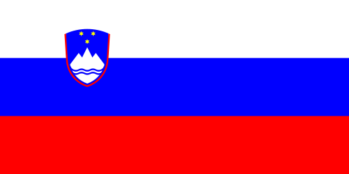
#235 Slovenia :

Self - the Republic of Slovenia

1:2 ratio
That blue is horrid, easily the worst blue out of every flag. The shield is extremely weak design wise and it's size makes it look like an afterthought. Feels like a flag drawn from memory where it's just that close to looking right.

#234 Northern Ireland :

United Kingdom - Same as self
The hand and crown is pretty cool but the composition is quite bad imo. Overall an alright flag but a big lost on potential. The disappointment is what's making it land so low.

1:2 ratio

#233 Bonaire :

part of Caribbean Netherlands - Bonaire, Sint Eustatius and Saba

2:3 ratio
Looks too much like the colorado flag design wise. A bit too modern and the symbols aren't detailed enough. The red six-pointed star represents the original six villages of Bonaire: Antriol, Nikiboko, Nort Saliña, Playa, Rincon and Tera Korá; which is a nice touch, keeping the island's history before colonization. Sadly the yellow, white and blue (like always) represent respectively the sun, the sky and the sea.

#232 French Guiana :

France - Guyane
Simple and effective but with the worst color combo imaginable.

2:3 ratio